Dustin K MacDonald

Menu
  • Home
  • About
  • Economic and Community Development
  • Nonprofit Management
    • Counselling and Service Delivery
    • Suicide Prevention / Crisis Intervention
  • Politics and Governance
  • Math and Statistics
  • Salesforce
Menu

Frequency Distributions

Posted on January 24, 2015November 25, 2018 by Dustin

Frequency distributions are a simple way of organizing data based on how many each item has occurred. This can be used for individual values or for age ranges.

The steps for making a frequency distribution are pretty simple. Let’s take a set of 20 students and their ages:

18 17 17 18 15
15 17 14 15 16
16 16 17 14 17
14 15 14 16 17


Creating a Frequency Distribution:

  1. Determine the highest and lowest scores
  2. Create two columns, label the first with the variable name, label the second frequency
  3. List the full range of values that encompass all the scores in the data set from highest to lowest. Include all values in the range, even those for which the frequency is 0
  4. Count the number of scores at each value and write those numbers in the frequency column.

Let’s work through these steps one by one.

  1. The first step is to establish the highest and lowest scores. In this example, the highest score is 18 and the lowest score is 14.
  2. Creating two columns, we’ll call the first column “Student Age” and the second column “Frequency”.
  3. Next, we’ll add each of the ages, 14-18 to our chart and count how many times each one occurs
Student Age Frequency
14 4
15 4
16 4
17 5
18 2


As you can see, each of the values occurs four times, except for the age 17 which occurs five times, and the age 18 which only occurs twice. From this data we can begin drawing rudimentary conclusions about the individuals in the sample. For instance, this group is relatively evenly distributed, except for 18 year olds which are under-represented.

Group Frequency Table

If your data exists in a range, you can also create a grouped frequency table. This is similar to a regular frequency table but is often used for data where there can be many specific values (for instance, recording the speed at which a person performs a task can result in values that go into the millisecond.) In cases like these, grouped frequency tables are helpful.

It is slightly more complicated to put together. Before we start, let’s go over some definitions.

  • Lower Class Limit – are the smallest numbers that can actually belong to the different classes
  • Upper Class Limit – are the largest numbers that can actually belong to the different classes
  • Class Boundaries – are the numbers used to separate classes, but without gaps created by the class limits

Let’s use the following dataset that contains 16 people, using the amount of time it took people to perform a task to demonstrate these terms:

Lower Class Limit Upper Class Limit Frequency
0 Under 1.5 4
1.5 Under 3.0 5
3 Under 4.5 3
4.5 Under 6.0 3
6.0 Under 7.5 0
7.5 Under 9.0 1


What “under 1.5” means is that any value between 0 and 1.499 would qualify, but it is worded this way to simplify things.

How did we decide on the intervals here (e.g. 0 to 1.5, 1.5 to 3 and so on?) We used something called the 2k guideline.

The 2k guideline says that the square of the correct number of intervals should be greater than the number of items in the dataset. F6or instance, in our example we have 16 people, so let’s work through the squares:

  • 2^2 = 4
  • 2^3 = 8
  • 2^4 = 16
  • 2^5 = 32

So, in this example we could use only 4 intervals if we needed to, but the authors of the set (which came from a statistics textbook) chose to use 6 to make the data easier to see. Ideally you want the number to be between 5 and 10.

To determine the best distance between the intervals (in this case they’ve chosen 1.5), you can take the range (which is the highest value minus the lowest value) and divide it by the number of classes.

Let’s assume the highest value was 8 and the lowest value was 0.1. Our “distance calculation” would thus be: 8 – 0.1 / 6 = 1.31. Again, the authors chose to use a simpler value to make interpreting the data easier.
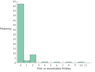
Histogram

Once you have your frequency distribution, you can turn it into a visual display with a histogram, which looks almost like a bar chart and enables us to see the data at a glance. An example of a histogram is below:


Cite this article as: MacDonald, D.K., (2015), "Frequency Distributions," retrieved on December 2, 2023 from https://dustinkmacdonald.com/frequency-distributions/.

2 thoughts on “Frequency Distributions”

  1. Pingback: An Introduction to Intelligence Analysis and Research | Dustin K. MacDonaldDustin K. MacDonald
  2. Pingback: An Introduction to Intelligence Research and Analysis - Intelligence Analyst Training

Leave a Reply Cancel reply

Your email address will not be published. Required fields are marked *

Privacy Policy

See here for our privacy policy. This site uses affiliate links and Adsense ads to provide targeted advertising.

Tags

analytical technique assessment communication community development counselling crisis chat crisis intervention data science eastern university economic development education empathy evaluation forecasting fundraising governance information technology intelligence intelligence analysis keokuk county language learning legal management peer support personal development phd politics professional development protective factors psychosocial risk factors safety planning salesforce sigourney social media statistics suicide suicide assessment suicide risk assessment technology terrorism training university of the cumberlands violence risk assessment youth

Recommended Posts

  • Conducting Psychosocial Assessments
  • DCIB Model of Suicide Risk Assessment
  • ABC Model of Crisis Intervention
  • My Friend is Suicidal - What do I do?

Recent Posts

  • ITS833 Information Governance
  • Enhanced Care Management (ECM) with Salesforce
  • ITS835 Enterprise Risk Management
  • Glorifind Christian Search Engine
  • Sigourney Iowa Election Results, 2023

Archives

  • November 2023 (6)
  • October 2023 (1)
  • September 2023 (3)
  • August 2023 (1)
  • July 2023 (1)
  • May 2023 (1)
  • March 2023 (1)
  • February 2023 (2)
  • January 2023 (4)
  • December 2022 (2)
  • May 2022 (1)
  • April 2022 (2)
  • March 2022 (1)
  • February 2022 (1)
  • December 2021 (1)
  • October 2021 (1)
  • August 2021 (2)
  • May 2021 (3)
  • December 2020 (1)
  • November 2020 (4)
  • July 2020 (1)
  • June 2020 (1)
  • April 2020 (1)
  • March 2020 (4)
  • February 2020 (7)
  • January 2020 (1)
  • November 2019 (1)
  • October 2019 (2)
  • September 2019 (4)
  • August 2019 (2)
  • March 2019 (1)
  • February 2019 (1)
  • January 2019 (1)
  • December 2018 (4)
  • November 2018 (3)
  • October 2018 (3)
  • September 2018 (19)
  • October 2017 (2)
  • September 2017 (2)
  • August 2017 (1)
  • July 2017 (39)
  • May 2017 (3)
  • April 2017 (4)
  • March 2017 (4)
  • February 2017 (4)
  • January 2017 (5)
  • December 2016 (4)
  • November 2016 (4)
  • October 2016 (5)
  • September 2016 (4)
  • August 2016 (5)
  • July 2016 (5)
  • June 2016 (5)
  • May 2016 (3)
  • April 2016 (2)
  • March 2016 (2)
  • February 2016 (2)
  • January 2016 (4)
  • December 2015 (2)
  • November 2015 (2)
  • October 2015 (2)
  • September 2015 (2)
  • August 2015 (1)
  • June 2015 (2)
  • May 2015 (5)
  • April 2015 (3)
  • March 2015 (8)
  • February 2015 (12)
  • January 2015 (28)

Meta

  • Log in
  • Entries feed
  • Comments feed
  • WordPress.org

Recent Comments

  • Dustin on Starting a Crisis Line or Hotline
  • HAPPINESSHEALTHCOURAGE, LLC on Starting a Crisis Line or Hotline
  • ITS833 Information Governance - Dustin K MacDonald on University of the Cumberlands PhD in Information Technology
  • Elected Officials in Sigourney, Iowa - Dustin K MacDonald on Sigourney Iowa Election Results, 2023
  • ITS 835 Enterprise Risk Management - Dustin K MacDonald on University of the Cumberlands PhD in Information Technology

Tags

analytical technique assessment communication community development counselling crisis chat crisis intervention data science eastern university economic development education empathy evaluation forecasting fundraising governance information technology intelligence intelligence analysis keokuk county language learning legal management peer support personal development phd politics professional development protective factors psychosocial risk factors safety planning salesforce sigourney social media statistics suicide suicide assessment suicide risk assessment technology terrorism training university of the cumberlands violence risk assessment youth
© 2023 Dustin K MacDonald | Powered by Minimalist Blog WordPress Theme